Hi, welcome to this tutorial. Today, I will be explaining how to build websites that are fully responsive to all screen sizes with CSS3 media query. 🚀
So sit back, put your seatbelts on, Let's Ride!🚀

So what is a Media Query?
Media query consists of a media type and one or more expressions, involving media features, which resolve to either true or false. It is written as
@media screen and (max-width: 768px) {
    body {
       display : none;
    }
}
The code above, simply means if the screen size is <=768px (less than or equal to 768px), the body of the HTML page should be blank.
The result of the query is true if the media type specified in the media query matches the type of device the document is being displayed on and all expressions in the media query are true. When a media query is true, the corresponding CSS styles are applied.
For a website to be fully website, Breakpoints are used.
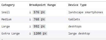
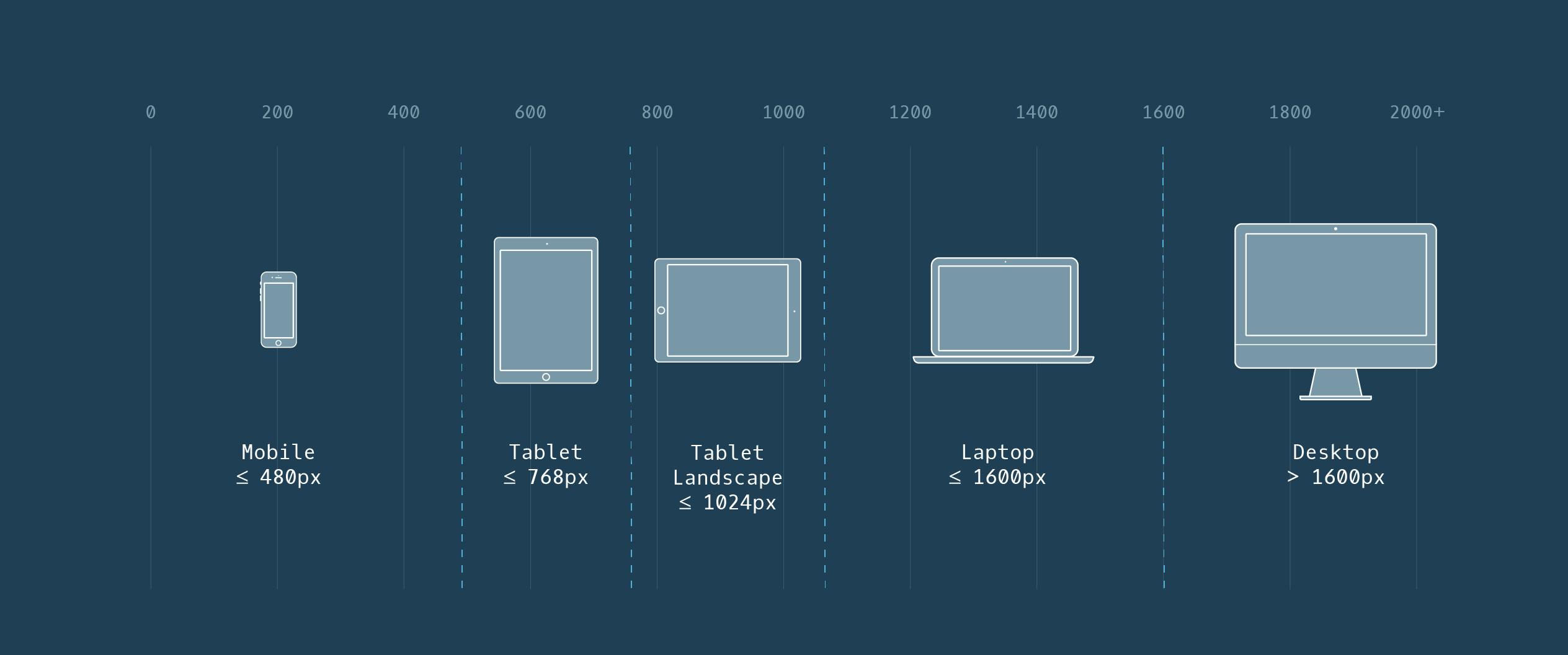
Breakpoints are customizable widths that determine how your responsive layout behaves across device or viewport sizes. They can be at any point you choose to make them available, but mostly, at the points where your website layout breaks.
Breakpoints are the building blocks of a responsive design
Here is an image of breakpoints, you should note, either of the two can be used.


So let's jump right into the practical use of media query and make a website layout fully responsive.😀🚀
I just created a website layout using CSS Flexbox, if you are not familiar with flexbox, you may check here
##Here is an Exercise for you 😀🚀 🚀 Edit this code on Codepen
🚀 Share the link your solution in the comment section
My Solution 🚀 : Download the Source code here
I hope you enjoyed this short tutorial on Media query?

Follow and Connect with me on 🚀 Linkedin 🚀 Twitter 🚀 GitHub
You may also view more examples 🚀 W3Schools 🚀CSS Tricks 🚀 MDN

